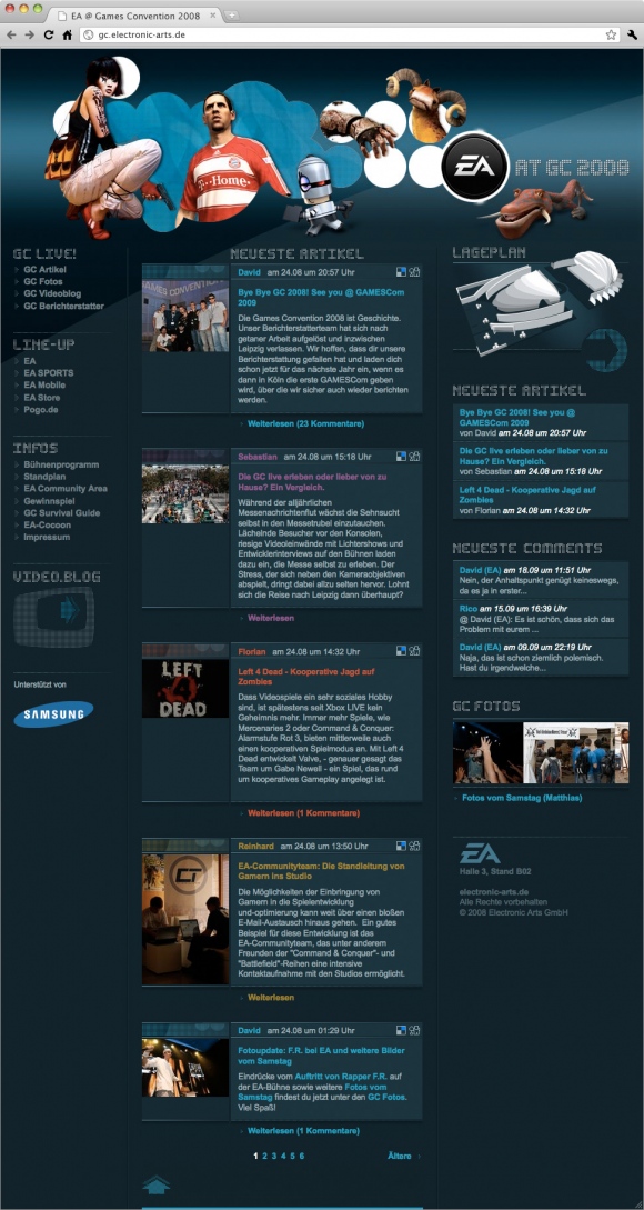
Once again okamo had the honor of developing the design for the exclusive Games Convention 2008 website for Electronic Arts in 2008. It marks the fifth time in a row that we have been commissioned with this brilliant project. This year the basic design of the stand at the show remains the same. The Cocoon proved itself last year already and was only slightly modified for this year’s convention. It remained a mainstay of all of EA’s activities. However for the website we embarked on a new path: we intentionally turned away from the minimalist design of 2007 and opted for a more opulent design with more feeling in the details. This year’s design really came into its own and included articles and images from EA reporters that users could comment on as well as the latest news from the convention and product information.


We always pay particular attention to the headers of the individual areas on the website. Each of the different product lines and functional areas of the website are given a different key visual that help tune in the users to the specific area of the site by means of visual compositions. Before the graphics for the home page and various areas for EA and EA Sports can be designed, the online marketing department is consulted. Each visual component is discussed in detail with the respective product managers and developed in close cooperation until the final image is ready.

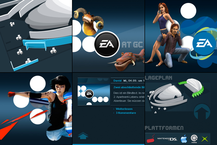
Excerpts from our design for EA@GC 2008. Less blog-oriented and sober, far more mood setting and more oriented to the gaming website: appealing, compact and more depth visually. The website builds on the proven structure from the previous year's website: interactive features such as comments and video blogs that were made possible with the cooperation of YouTube also form a part of the offerings on the 2008 website. As do product information on all of the new games, interviews with game developers, videos of the games, and much, much more.


