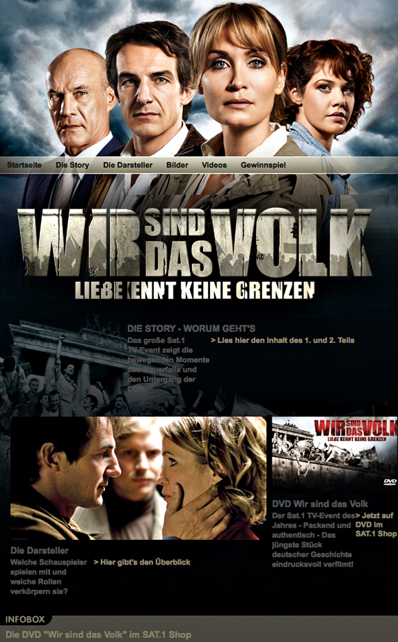
The final logo for "Wir sind das Volk" developed by okamo as part of the huge Sat.1 TV event in 2008 attempts to compress the magnitude and extent of the historic events as a visual element. The movie was premiered on Sat.1 on October 6 and 7, 2008. The monumental lettering shows the most important thematic elements: the silhouettes of peaceful demonstrators standing in front of the Berlin Wall.
The Logo in Use on the SAT.1-Website
Use of logo in web marketing for the TV event has shown the extent to which the logo’s design fulfills billboard format standards: it embodies the entire drama against a historic backdrop and integrates itself into a powerful image for the overall composition.

Drafts
1. Our first draft for the logo was based on a font that reflected the magnitude and difficulty of the historic events: an uppercase, bold sans-serif font that appears to be aflame with Germany's colors.
2. We greatly reduced the colors in another version and gave it a more ironclad effect.
3. We concentrated the typeface even more to add to the visual impact and set the font to maximum compactness and placed it more toward the center. The barbed wire helps to offset the main line from the sub-headline.
4. Here's the first attempt at integrating the rounded top of the Berlin Wall, which was to prevent people from climbing over it, into the visual, thus drawing the title a little more into the real world.
5. We interpreted the I in the word "WIR" [we] to symbolize the typical boundary post used in East Germany in order to reintegrate Germany’s colors, which have had a strong visual impact on the historic events, in a more accentuated form into the design.
6. Eine andere Möglichkeit, die drei Farben wieder ins Bild zu bringen: eine Fahne ist klar sichtbar und setzt einen optischen Akzent in der Menschenmenge.

