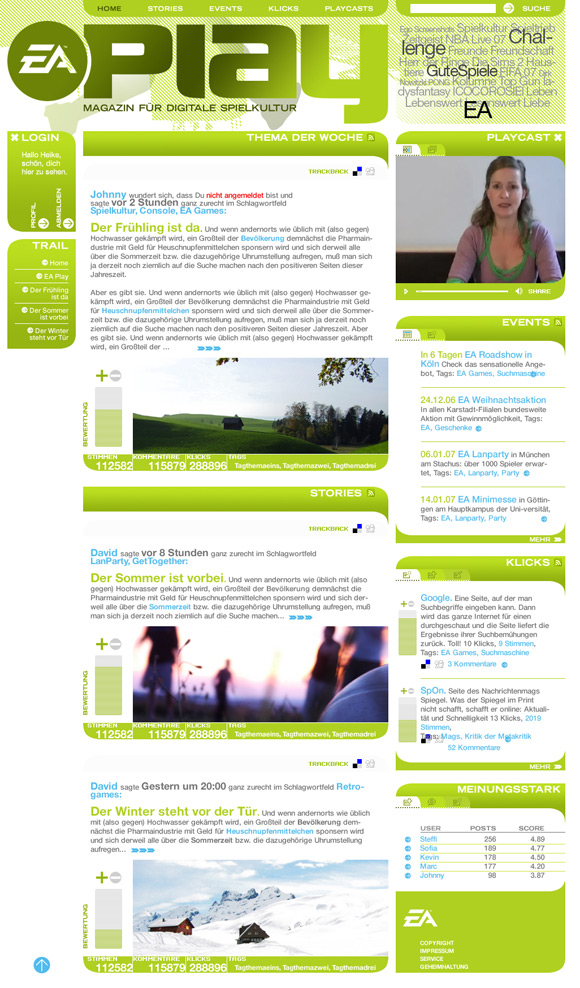
EA Play: The Homepage
Electronic Arts (EA) commissioned okamo in November 2006 with the development of the visual concept for a project involving a new kind of "magazine for the digital gaming world," an idea that had been in the pipeline for some time and had taken various shapes. The concept in terms of the content focuses on the integration of users and offers generic content along two different lines: there is a blog that is filled with content by members of the Spreeblick editorial staff and there is a vlog that featured a new videocast by Patrizia once a week.
This new magazine replaced the T-EA-M website designed by okamo in 2005. It also modernized the underlying idea behind T-EA-M, created a stronger tie to EA users and customers in terms of content, offered exclusive content, and was based on a flat hierarchy which combines clearly structured information and entertainment offerings.
Okamo’s job was to design the visual concept for the new website and incorporate a strong focus on user participation, develop a logotype, structurally arrange the possibilities for interaction, and integrate all of these ideas into a convincing design. Minkenberg Medien handled the entire production within six weeks, from kick-off and logo development to fine-tuning the structure of the content, from creation of the design, the final artwork and icon creation to its technical implementation.
The home page of the new website, offering everything related to the world of digital gaming, features an evocative page header reminiscent of a print magazine's cover page, provides a prominent space for the tag cloud next to the logo and positions the main keywords for the content in the header of the page even.
EA Play: The Icons
The EA Play website foresees high user participation. For this reason it has several interactive services that required the development of a series of apt icons. They are intended to provide easily identifiable information used for the commenting and filtering features for articles in the smallest space possible.
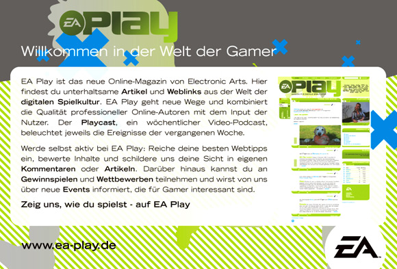
EA Play Flyer


okamo designed a flyer to include in product packaging for distribution at future events in order to optimally link the online world with the offline one. We created a DIN A5 flyer that closely resembled the online design. It varied somewhat, yet maintained sufficient proximity to the new brand in spite of the great visual distance, which builds up the excitement and interest in users. The screenshots shown here were reconverted into RGB from CMYK and color saturation was improved for presentation on computer screens such that the results were satisfactory for our "online" eyes. We think that RGB’s relationship with CMYK is similar to that between East and West Germany. ;)

EA Play Drafts
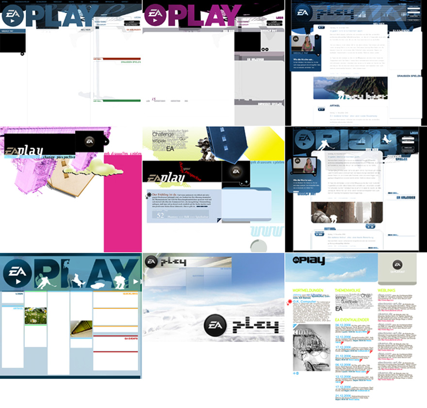
Creating a design quite often means shaping one: exploring various visual themes, testing various interface plans, finding the right mix of colors, getting an indication of the right solutions for details, playing with the development of a potential icon language, contrasting very different basic linguistic concepts, etc.
At okamo we often cooperate with design studios in our first project phase once we have come up with a worthwhile concept in terms of content and functionality. In the second phase we have a look at the surveys in-house and discuss the pros and cons of the various approaches. We attempt to find a new line that combines the strengths of the individual drafts without watering down the basic visual idea.
EA Play Logo Drafts
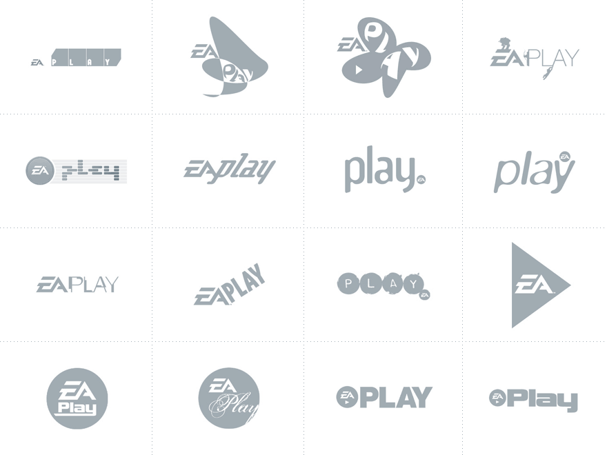
The road to creating a concept for this online offering was long and winding. We discussed numerous approaches, asked various service providers to assist us in the concept, tossed over aboard a number of unnecessary content elements very late in the game, and finally began with project implementation. EA placed no restrictions on the design of a logotype. A preselection of all potential drafts was made by the online marketing team before being submitted to the EA legal department for approval. Here you can see a selection of surveys that made the final cut after a long, intense selection process. Within just two weeks, it was possible to finalize the selected logo and draw the final artwork, as you see further below.
EA Play Logo Development
The next step after establishing the basic shape of the logotype and the adapted EA logo is the process of shaping the individual logo. The goal of the macro- and microtypographic fine-tuning and optimization processes is hopefully a successful, compact, and precise visual sign that can be used in all required media (Internet and print, including on very small scales).
The process of fine-tuning began after the decision was made for a very simple, straightforward, and direct implementation of the name as a logotype: The favored version with narrow, uppercase letters quickly gave way to a typographic shape that used upper- and lowercase letters that were a little wider. The second version offers the advantage of filling in the unattractive empty space between the L and the A and becomes more compact overall. To further increase this compactness, we decided to mix redesigned uppercase with lowercase letters of the same height. Not only did we scale up the lowercase letters, we also adapted the finer typographic aspects of the height to those of the uppercase letter. To avoid confusing the L in "Play" with an I, we dynamically transformed the bottom of the L, which is generally flat, using the curve on the left of the A as our basis. Rounding off the idea of visual compactness, we thought it would be interesting to move the simplified version of the classic EA medallion closer to the word "Play" and have it overlap with the P and cut into it a little to bridge the gap. The integration of the tagline "Magazin fĂĽr Digitale Spielkultur" [Magazine for Digital Gaming] and the addition of color (a fresh green with brightness scale along two axes) touched up the development work and resulted in an appealing, visual recognition object without a lot of embellishment, which can be used both on- and offline and helps to establish the visual identity of the website substantially.