Nick: Details


Children do not think along rational lines, which often form the basis of traditional portal sites. Therefore we chose an untraditional widescreen format where the browser can only show a small section of the offering. Our theory is that children want to be able to scroll up and down on a page (if it's worth it and lots of fun). And it was precisely our thought too. Scrolling turns into an adventure with lots of things to discover on Nick Street. The sequence of the content is changed on a daily basis following the current TV schedule. Select highlights of the day are shown in the correct order. The left-hand side of the street is for Nick Jr., the center section is for Nick, and the right-hand side is for evening programming with family shows and comedies. This way we were able to avoid a segmentation of the site into different portals (at least in the initial phase) and we could emphasize the integrative aspect of Nick.
Nick: Presentation

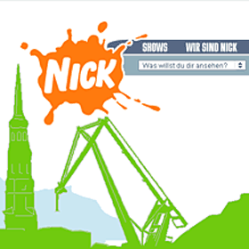
With our concept we propose a radical change when it comes to the traditional series of questions related to the preferred screen resolution. We didn’t get rid of the scroll bars. We showed that scrolling can be fun, that scrolling on our website is similar to how kids roam around in the "real" world when they work on things and communicate. The kids can discover Nick.de while holding on to their mouse with the scroll bar as their friend. The instant that the user loads the home page he/she will be guided by script and automatically scrolled over to the current moment on the timeline. He/she can then immediately see what is airing on Nick right at that moment. Although the online world is closely linked to the on-air world, the website remains extremely independent in its looks, the variety of background information available, and in particular the increasingly important aspect of interactivity that takes kids seriously. All pages for TV shows, specials, the TV guide, information for parents, safe-surfing areas, etc. are opened in a new window that resembles the skyline and the Nick Street home page in its basic design, which retains the close connection to the "mother" website.
Nick Draft II

And here’s yet another quote from an okamo internal memo: "Imagine this. We build a street, a neighborhood. All the houses are different (as their owners are too) and stacked next to each other ... I’m sure the kids’ friends live in the neighborhood too. I’ll visit this friend today, that one tomorrow ... Kids are used to walking down streets (like on their way home from school). There’s always something to look at here and there .... We build a street. Abstract (because of the amount of data involved), find a design for our own easy-going style. The shows and characters can be quickly associated with the right houses. The avatar building: Asian-looking. Braceface: School building. The Backyardigans: outside on the playground. Clueless: reminiscent of Beverly Hills (with palm trees, a city hall). Grisu: volcano, cave entrance. SpongeBob: totem-pole house, etc. I’ve checked things out. It’ll be easy to find something suitable for everyone.
Yet, the bare minimum, everything should be drawn simplistically. In front we have the characters (looking out the windows, waving, inviting you in), and underneath we could put something like a key or a legend. Small logos ... And above, maybe some gags? Small images? My attempt at it in the attachment. Very rough yet. One important thing: This very familiar environment always remains visible and open in the background. Individual details or content (links are in different colors, 3D, highlighted) are found in new windows. And to keep everything important from only being on the left-hand side: Whenever you enter this street (by typing in the www. address), you will leave it in another, randomly selected spot. But everything is equally important. The concept is that you have an exciting, safe street that leads through a familiar, easily identifiable neighborhood. Kids get to decide who they visit next. It’s just a lot of fun for them to explore this street (which rightly justifies the not-everything-all-at-once approach)."
Nick Draft I

Here's the underlying idea aptly put in a company e-mail: "We could set up a home page where you scroll on it horizontally. The idea is that that we design the home page based on a 500 x 5000 pixel format (height x width). An extremely different, widescreen approach. For kids it's great, I guess (I don't have any, so I can't really say for sure). But books use a similar format and aren't designed to be read from top to bottom. The future lies on the right! It could be like a comic book. A presentation with this format would definitely turn heads! We could print it out on a ream of paper that's 2 meters long and 21 cm wide and unroll it on the table. I've already looked into it. Our Epson printer could handle the job. And Papyrus.com has reams of paper (even though they get on our nerves). And our Epson has a support for the paper roll. We would have a really cool layout using the horizontal format. We could make something of it. A bunch of things.
Nick Sketches
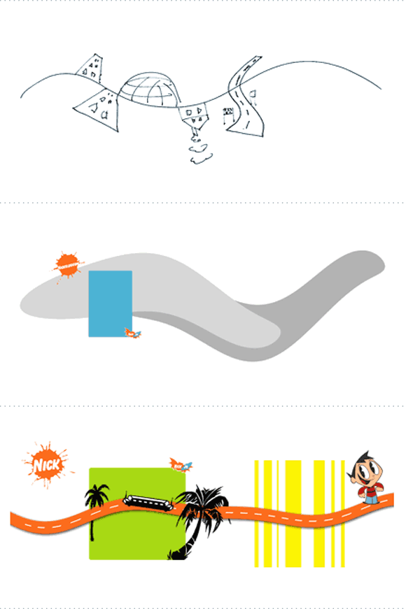
The first sketches for the project. Actually everything's already there: the widescreen format, the dynamic lines, the metaphors for the streets and city concept, the playful approach for its layout. And yet there's a long way to go before we had a visual concept ready for presentation ...

